
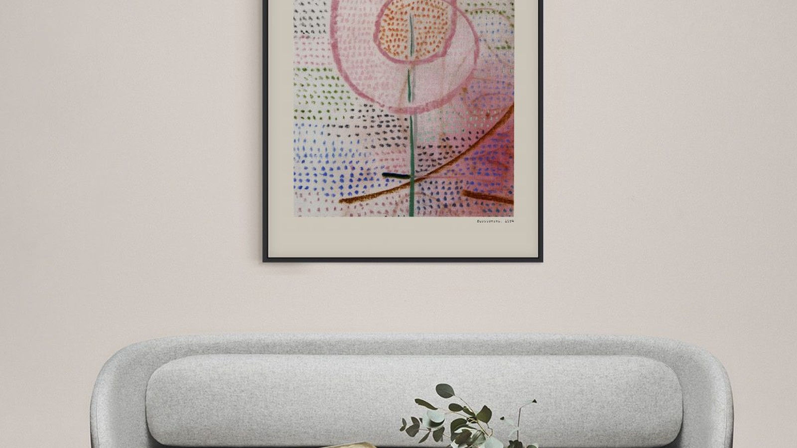
Paul Klee and the Quiet Wall
Klee is the artist people come back to after they have lived with something louder for a year. His prints are built from thin lines, soft blocks of colour and small marks, and none of it survives on a busy wall.
What follows is how to give a Klee print the room it needs.
Small gestures need space around them
A Klee composition usually holds one idea and a lot of air. Put it next to three other frames and the air disappears, because the eye reads the group instead of the drawing.
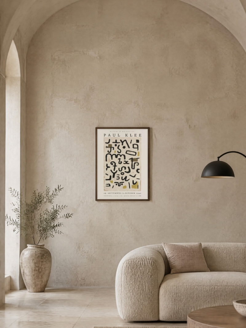
Give it a wall of its own, or at most one companion. At 50 x 70 cm the print already feels generous, because the drawing inside it is small and the paper does the rest.

Keep the wall pale and the light soft
Muted colours disappear against strong ones. A pale wall keeps the subtlety, a strong wall swallows it.
Light matters just as much. Klee’s surfaces are close in value, which means the difference between one grey and the next is small. Harsh light from one side flattens that difference and the print looks washed out. Soft, even daylight keeps the layers visible.
A wall opposite a window is ideal. A wall with a lamp close to it works in the evening, as long as the lamp is not directly in front of the glass.
Where a Klee print belongs in a flat
- Bedroom. The best room for it, because it is read in the morning and in the evening, slowly.
- Reading corner. A print that rewards a second look belongs where somebody sits still.
- Hallway, only at the end. If it is on the wall you walk past, it needs to be at the far end where you face it, not beside you.

Frames and mounts
A narrow light wood frame with a white mount is the combination that suits these prints best. The mount separates the drawing from the wall and gives the composition the margin it was drawn with.
A wide black frame works against the delicacy of the line. It is not wrong, but it changes the print into something more graphic than it is.
Sizes that let it stay quiet
50 x 70 cm is the natural size for a Klee. Larger formats are available and they work on a big empty wall, but they turn a quiet print into a statement, which is usually not why people choose Klee.
If you want two prints, put them side by side with 5 to 8 cm between frames and keep the pair centred at the same height as a single print would be. Do not stack them.

What the print can and cannot do
Our Klee posters are reproductions on matte paper. The subtleties of the original surface, including the texture of the paper and the thickness of the paint, are flattened by any print, ours included. What survives is the composition, the line and the colour balance.
More prints are in the Paul Klee collection.
Choosing between Klee prints
If you are deciding between several, look at how much of the sheet is left empty. The prints with more air are easier to live with in a small room, because the eye has somewhere to rest. The denser compositions, built from many small marks, need a larger wall and a longer look.
For a first Klee, pick one with a clear structure and few colours. It will still be interesting in three years, which is more than can be said for a print chosen for its novelty.
Small rooms and small formats
In a room under twelve square metres, 50 x 70 cm is already a large object. A 30 x 40 cm Klee above a desk or a small chest of drawers often reads better than a big print, because the drawing inside the sheet is small and the scale stays believable.
Keep the frame thin in small rooms, and keep the mount white. A wide black frame in a narrow room takes the wall apart.
Prints From the Klee Collection



FAQs
Is the poster a reproduction?
Yes. We print reproductions on matte paper, in the formats listed on each product page. We do not sell originals.
What size works best?
Above a sofa or a sideboard, 50 x 70 cm. On a wall of its own, 70 x 100 cm. Our guide to poster sizes lists every format with the space each one needs.