Details
The image
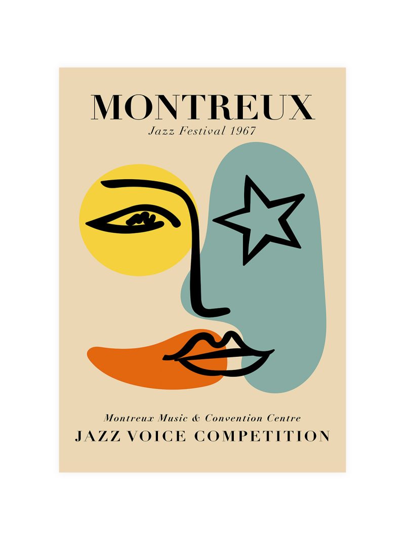
A composition of thin lines and small colour fields arranged like a diagram, with lettering set in a modern face along the lower edge. There is no perspective and no subject and the whole sheet is assembled from marks that look hand-made rather than mechanical.
Where it comes from
The poster announces the Paul Klee exhibition held at the Museum of Modern Art in New York from 19 September to 12 October 1942, a showing that introduced the Swiss-German artist’s work to a wide American audience. Klee’s drawings and paintings are built from graphic signs rather than from observation and museum posters of the 1940s, printed on tight budgets by designers who had come out of the European avant-garde, reproduced that language faithfully: a single drawing at size, restrained typography, nothing added.
On the wall
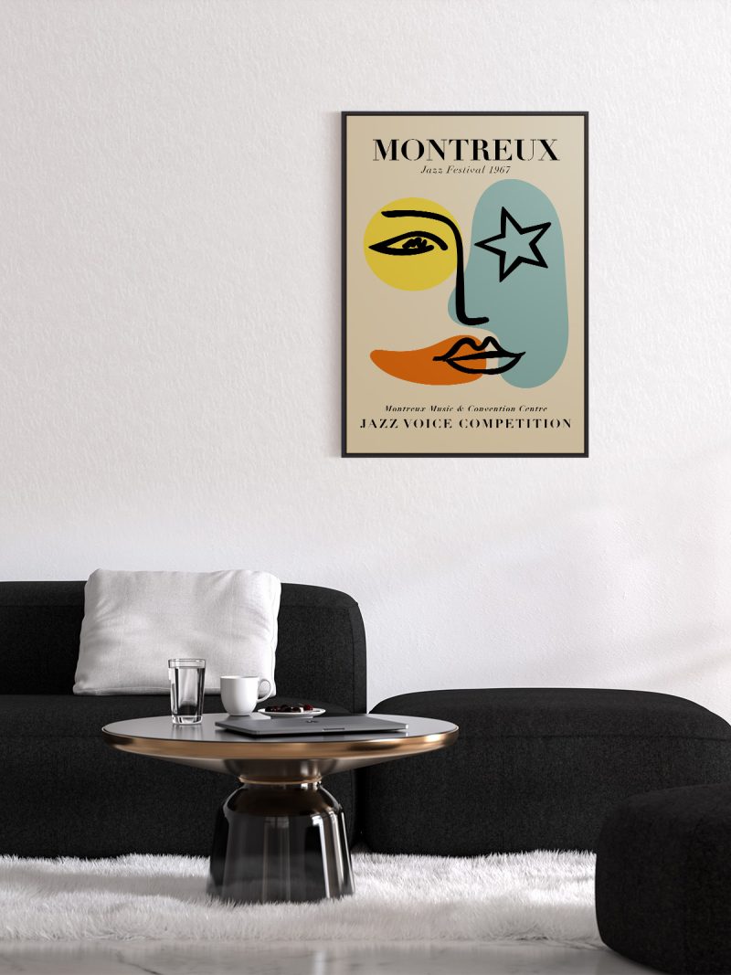
It suits a study, a hallway or a living room with plain walls, where a linear composition gives a wall structure. Because the palette is muted and the drawing is fine, it needs daylight and a wall that is not too busy. In a group it should be the lightest piece.
In company
A second sheet from the Modern collection will balance it rather than compete.Avoid hanging it beside saturated colour, the fine lines would disappear.