
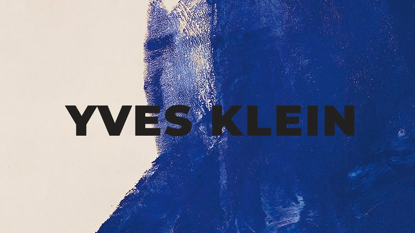
Yves Klein Princess Helena and the Blue That Holds a Room
Most posters on a wall ask to be looked at. This one takes over. Yves Klein’s Princess Helena is a blue field marked by the pressure of a human body, and on a plain wall it does something unusual: it makes everything around it look quieter. Below is what the work actually is, why the blue behaves the way it does, and how to hang a print this strong without turning the room into a poster shop.
What the Anthropometries actually were
Klein did not paint these works with a brush. He covered his models in dry pigment and had them press their bodies onto large sheets of paper and canvas, then directed the movement the way a conductor directs an orchestra. The result is not a picture of a body. It is a record of contact: the curve of a shoulder, the seam of a hip, the place where a hand stopped.
That is why the prints read differently from painted figures. There is no outline to follow and no face to recognise. You see a blue shape and only after a moment understand that it is a body, which is exactly the effect Klein was after. In Princess Helena the imprint is calm and frontal, and the composition stays quiet enough to work as a print above furniture rather than a loud accent.
Why this blue is not like other blues
Klein mixed ultramarine pigment with a synthetic binder so the colour kept the raw, powdery intensity of the pigment instead of turning into ordinary paint. He registered the result under his own name, and it is known as International Klein Blue. The point was not decoration. He wanted a colour that appeared to float free of the artist’s hand, with no brushstroke to remind you of a person holding a brush.
A faithful reproduction keeps that flatness. There is no gradient, no vignette and no texture borrowed from brushwork, just one saturated blue and the imprints. On a screen the blue looks almost black in places; printed on matte paper it opens up and turns warmer at the edges.
How to hang a blue print this strong
Large, saturated blue absorbs light. In a dark corner it goes flat and loses the shape of the imprint, so the wall matters more than the frame.
- Wall colour: white, off-white or pale plaster. A blue print against warm terracotta or orange will fight, because the two colours take brightness from each other.
- Light: soft, warm light from the side. Direct sun on blue pigment prints fades them over years, so keep the print off the south-facing wall or use a frame with glass.
- Height: the centre of the print between 145 and 150 cm from the floor, and roughly 20 to 30 cm above the back of a sofa or the top of a console.
- Size: 50 x 70 cm above a sofa or sideboard reads as part of the room. 70 x 100 cm turns the wall into the feature, and needs at least 60 cm of empty wall on both sides to breathe.
- Company: oak, linen, stoneware and white plaster all sit well next to it. Busy patterns and warm yellows do not.
If you are choosing between two formats, our guide to poster sizes lists every format we print in centimetres and inches, with the hanging heights that work above common furniture.
What you are buying, plainly
Our Princess Helena poster is a printed reproduction on matte paper. It is not the original work, not a limited edition and not signed. Colour is matched against a scanned reference, so small shifts against the original canvas are possible, and every screen shows blue a little differently. What you get is the composition at the size you choose, printed to be looked at on a wall rather than in a browser.
Where this print works best
It suits rooms that are already calm: a bedroom wall opposite the bed, a hallway where you pass it daily, a living room where the furniture is low and pale. It is a poor fit for a wall already carrying three other framed prints, because the blue needs empty space around it to read as one decision instead of one item in a grid.
Check Our Blue Poster Collection




FAQs
Is this the original artwork?
No. We sell a printed reproduction on paper, made in the sizes listed on the product page. The original is a work on paper and canvas held in a collection, and we do not sell originals.
Which blue is it?
The print reproduces the ultramarine hue Klein registered as International Klein Blue. Screens vary, and blue is the colour that shifts most between displays, so the printed sheet is the reference.
What size should I choose?
Above a sofa or a sideboard, 50 x 70 cm. On a wall with nothing else on it, 70 x 100 cm. Our size guide lists the exact measurements and the space to leave around the print.
Where can I see the original work?
We cannot confirm where the original is currently shown, so we do not claim a location. Holding collections publish their own catalogues, and that is the reliable place to check.