

The Journey Through Vintage Posters
A vintage poster was never meant to be looked at from a sofa. It was printed to sell a train, a ski resort, a race or a film, and it had one second to do it from a wall or a station platform. That urgency is why so many of them still work in a modern flat, where most of what hangs on walls is quiet.
We print a shelf of them, from Le Mans to Alpine ski resorts. Below is what makes these images hold up, and how to hang one without turning the room into a museum of advertising.

Why posters made to sell things still work
Commercial art from the middle of the last century had a hard job: be understood at a glance, from a distance, by someone walking past. The result is a set of rules that happen to make good wall art. One image. One idea. Type that reads in a second. Nothing decorative for its own sake.
That is also why a vintage poster rarely looks dated in a modern room. Furniture changes, but an image built to be understood instantly does not lose its job.
The palettes that survive a plain wall
Travel and sport posters rely on flat colour: deep navy seas, ochre mountains, a single red for the vehicle that has to be noticed. Put that against white or pale grey and the colours read exactly as intended. Warm walls are harder, because ochre and cream posters lose their edge against a beige background and start to look faded rather than aged.

Type is part of the picture
Most vintage posters carry the name of a place, a year or a race, set in a typeface that belongs to the design. That lettering is not a caption you can crop away. If you frame one of these prints, keep the whole sheet visible: cutting into the type takes away the reason the image was drawn that way.
Sizes that suit a modern wall
At 50 x 70 cm a travel poster reads as a piece of the room. At 70 x 100 cm it becomes the wall, which suits a hallway where nothing else competes. Avoid the temptation to go small: these images were designed for distance, and a 30 x 40 cm version of a mountain scene turns into a stamp.

Frames, and how much to add
A thin black frame contains the poster and separates it from the wall, which is close to how it would have looked on a station wall. A natural oak frame softens the same print considerably and suits rooms with wood and linen.
Skip the mount. A wide white border around a poster that was designed edge to edge makes it look like a document in a case, and it shrinks the image you paid for. If you want a border, choose one narrower than the type.
Where they belong in a flat
Hallways, kitchens, studies and stairwells, in that order. These are places where a picture is seen briefly and often, which is exactly how a poster was meant to work. In a living room, put one above a low sideboard rather than above the sofa, and let it be the only strong image on that wall.
Hanging, plainly
Centre the print between 145 and 150 cm from the floor and leave 20 to 30 cm between the bottom edge and the back of the sofa or top of the sideboard. One poster per wall is the rule that keeps a room calm. Two on the same wall only work if they are the same format, the same frame, and set 5 to 8 cm apart.
Light matters more than usual here. These prints are mostly flat colour, so a hard reflection from a window will wash out an entire half of the image. Side light is kind to them; direct sun is not, and it fades the reds first.
Prints From the Vintage Collection

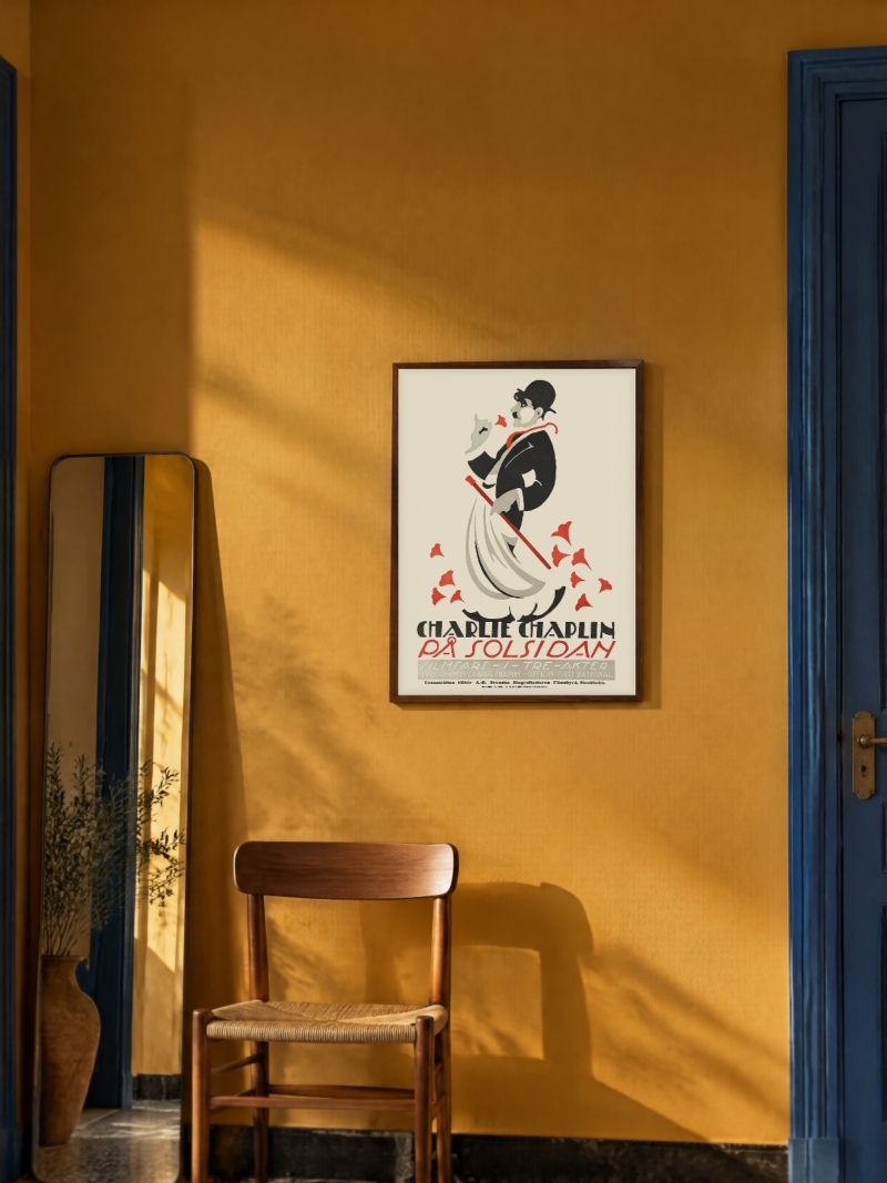

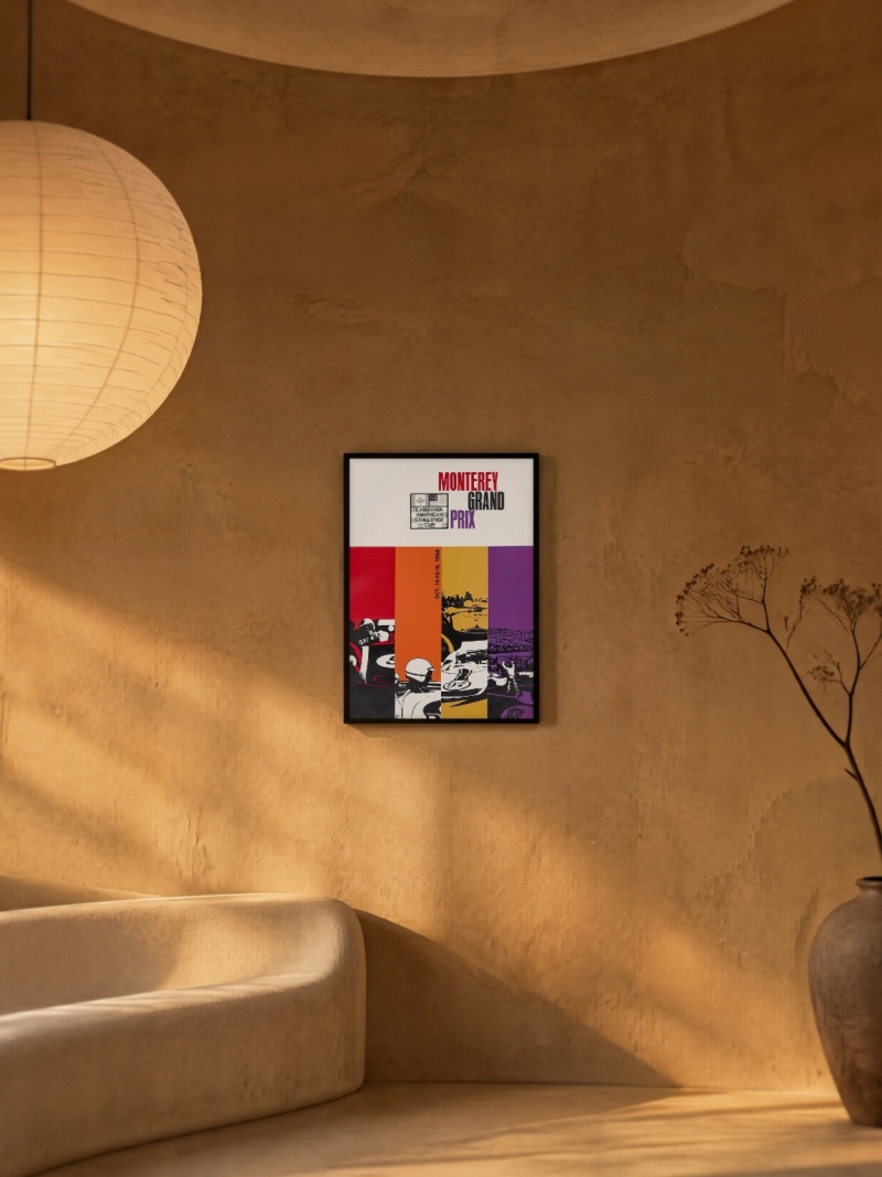

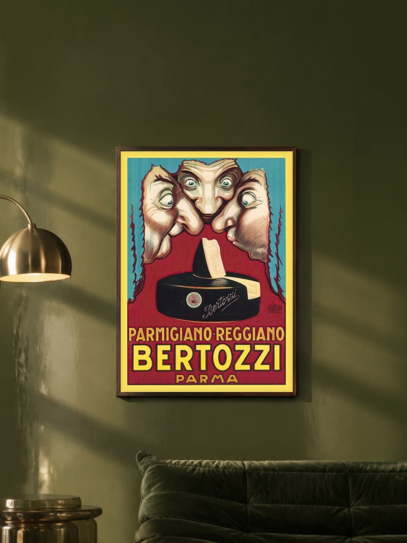

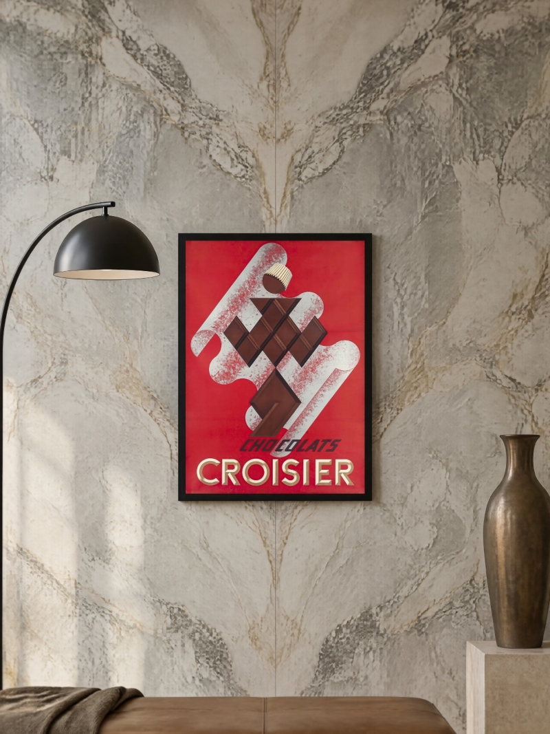
FAQs
Are these original vintage posters?
No. We print reproductions on matte paper in the formats listed on each product page. We do not sell originals, and nothing we ship is a limited edition.
What size should a vintage poster be?
50 x 70 cm above furniture, 70 x 100 cm where the print is the whole wall. Our guide to poster sizes lists every format we print with the space it needs.
Should a vintage poster be framed with a mount?
Usually no. These images were designed to run to the edge of the sheet, and a wide mount makes them look smaller and more like a document than a poster.