Details
The image
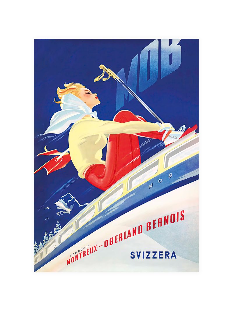
A slope drawn as a diagonal plane, figures small and leaning into the turn, the sky filled with one flat colour and the lettering tucked into a corner. Motion is suggested by posture and by the angle of the ground, not by lines.
Where it comes from
Winter tourism built its advertising on a simple claim: the snow is there, the air is cold, come down the hill. Posters of the 1920s and 1930s answered with geometry rather than with detail, because flat colour printed well, read from a distance and made the mountain look like a place rather than a photograph.
On the wall
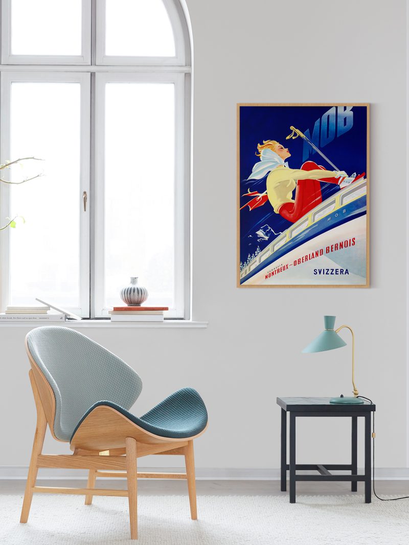
It suits a hallway, a bedroom or a staircase wall, where a diagonal composition adds movement to a narrow space. Because the palette is cool, it balances warm wood and strong textiles. In a bright room it reads as light; in a dark one it stays quiet.
In company
Pairs well with other alpine posters and with photography of mountains. In a group it should be the liveliest of the winter pieces. A plain frame without a mount keeps the slope reading as a plane rather than as a picture and the sheet works best where daylight reaches the wall during the day. The rest of the Vintage collection holds pieces from the same years and the same printing habits.