Details
The image
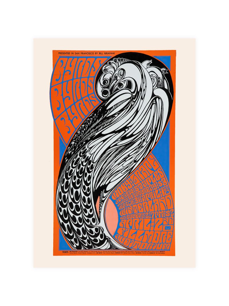
A landscape reduced to layered planes: mountains in flat colour, a foreground that suggests a platform or a road, and the sky left almost empty. Lettering sits in a corner, small and disciplined. The whole image is built with a handful of shapes that read as depth at a distance.
Where it comes from
Japan’s national railways sold travel the way European lines did: with posters that promised scenery rather than speed. In the 1920s and 1930s the country’s graphic designers absorbed European modernism and applied it to their own landscape, producing posters that look both Western and unmistakably Japanese. The economy of means came partly from printing limits and partly from tradition.
On the wall
It works as a window: layered shapes pull the eye into depth and make a small room feel longer. A hallway, a study or a bedroom suits it, especially where the palette is already light. Because the composition is quiet, it does not fight furniture, and it holds a large wall without shouting.
In company
Pairs well with woodblock prints and with other travel posters, and it looks right above a low shelf where the layers have somewhere to travel. In a group it should be the calmest piece. A pale wood frame suits it better than black, which would cut the sky off. The Vintage collection keeps the same economy of means.