Details
The image
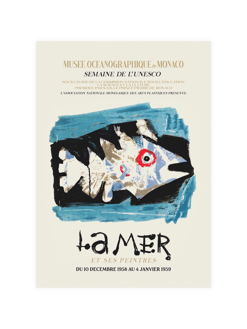
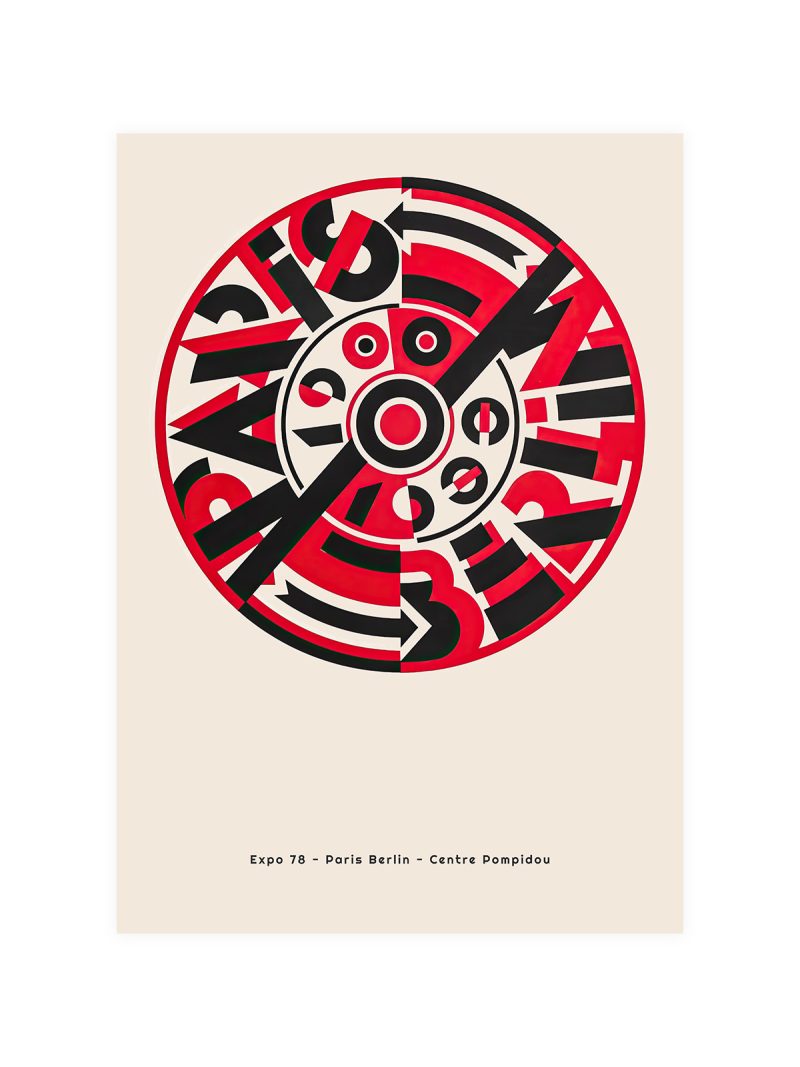
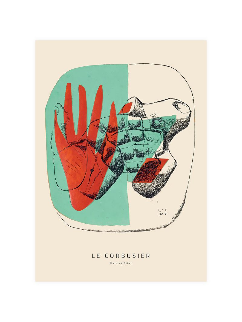
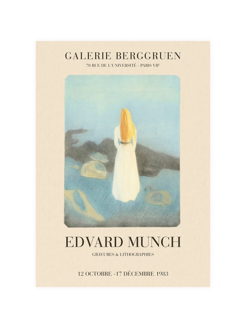
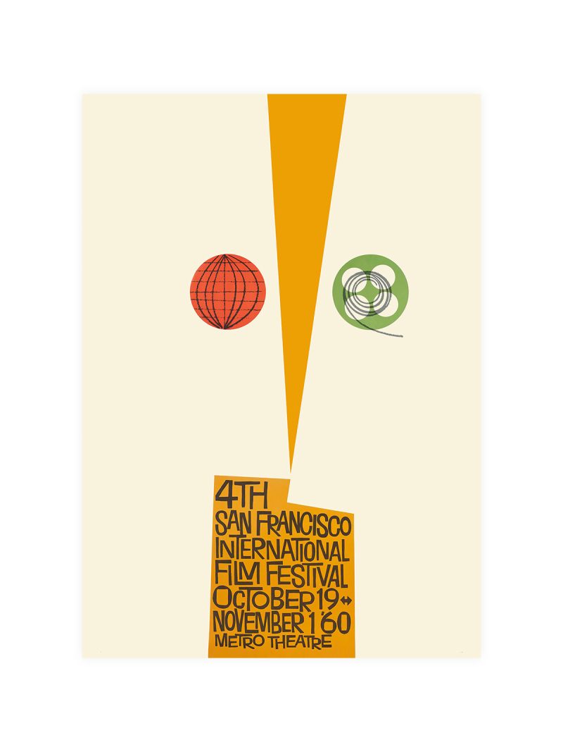
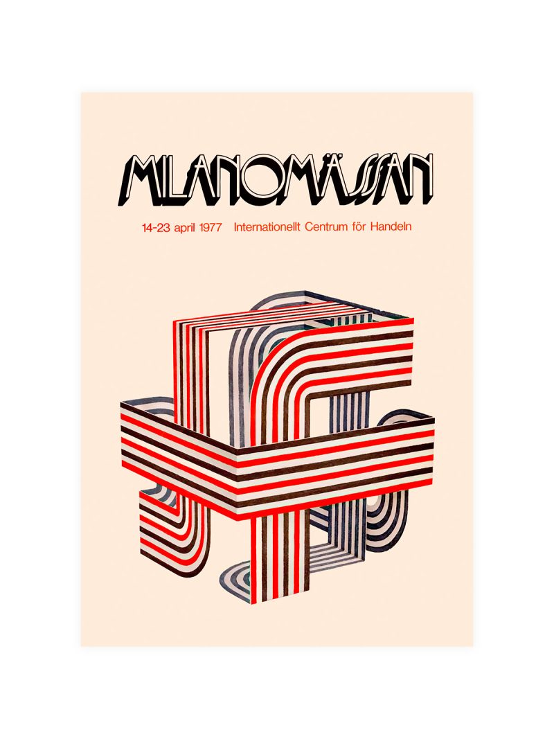
A composition of soft shapes and muted colour, with the exhibition details set small and formal at the base. The image is abstract but not cold: the forms overlap and blur slightly and the palette feels printed rather than painted. Nothing is outlined heavily.
Where it comes from
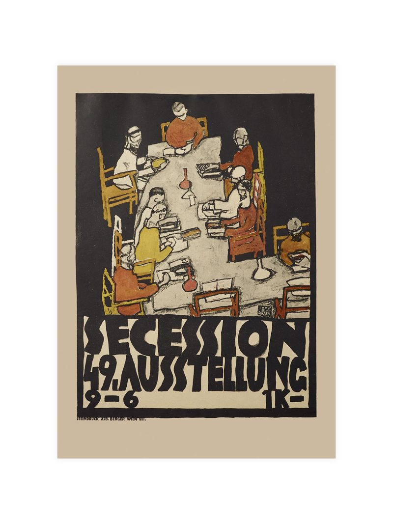
Post-war European exhibition posters were commissioned to announce a show and to outlive it. Designers of that generation worked with lithography and then with offset and they learned to let colour do the work: a few overlapping forms reproduced well, travelled well and looked serious enough for a gallery wall.
On the wall
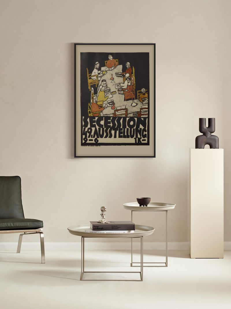
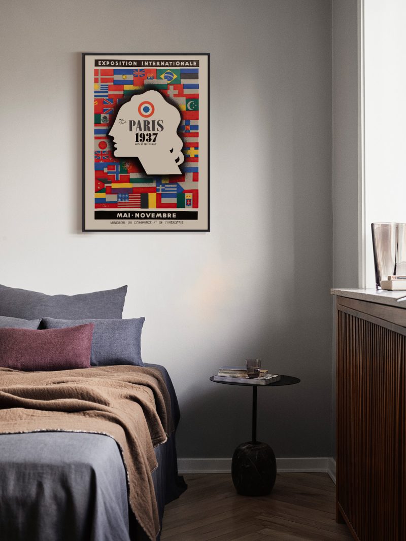
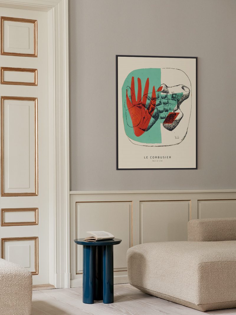
It is easy to live with, which is its virtue: a study, a hallway, a bedroom with pale walls. Because the palette is quiet, it does not dominate and it holds a large wall without shouting. In a group it works as the piece that keeps the others calm.
In company
Pairs well with photography and with pale wood furniture and it looks best in a light frame. Avoid very saturated neighbours, the muted palette would disappear. Hung lower than usual. It reads as a print rather than as an announcement and the small type at the base becomes a detail worth stepping towards. The rest of the Exhibition collection holds pieces from the same years and the same printing habits.