
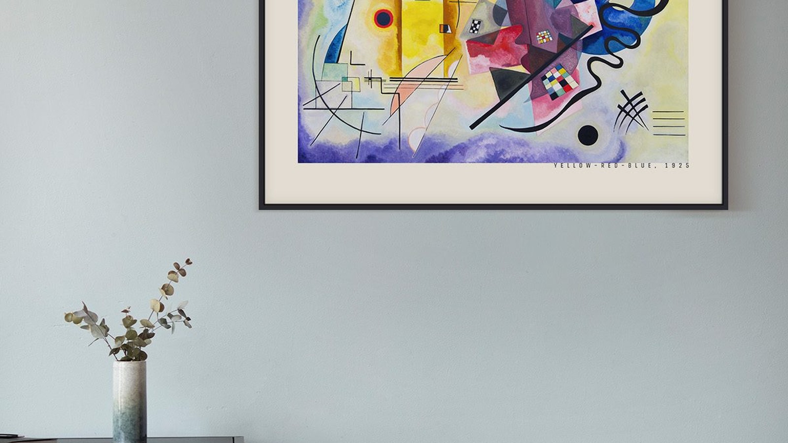
Kandinsky Posters and Where the Colour Sits
Most prints show you a subject with colour in it. A Kandinsky shows you colour as the subject. Circles, lines and angles are arranged so the colour does the talking, and that has consequences for the wall you put it on.
Why these prints take over a wall
When an image has no single focal point, the eye keeps moving. That is deliberate, and it means the print holds attention longer than a landscape does. It also means it needs a wall that is not fighting for the same attention.
A plain wall with nothing else framed on it is the safest. A wall with a mirror, a clock and two photographs is not.

Which wall colour holds the composition
- White and off-white. Neutral ground, everything visible. The default answer and usually the right one.
- Pale grey or greige. Calms a very colourful print and makes it look more considered, at the cost of a little brightness.
- Deep navy or charcoal. Only for prints with a lot of light areas. On these walls the bright shapes float and the composition reads almost like a diagram.
What to avoid is a wall colour that appears in the print. A red wall behind a print with large red shapes makes those shapes disappear.

Size and distance
These prints are read as a whole, so they need a little distance. Above a sofa, 70 x 100 cm is often better than 50 x 70 cm, because the composition is dense and a small version turns into a pattern instead of an image.
Above a sideboard or in a hallway, 50 x 70 cm is enough. The rule stays the same: centre of the print between 145 and 150 cm from the floor, 20 to 30 cm above the furniture.
The frame should stay out of the way
A thin black frame draws a line around the composition and stops it leaking into the wall. A thin natural wood frame softens the whole thing.
Do not use a coloured frame, and do not use a wide mount. Both add geometry the artist did not compose, and in a print built entirely from geometry that is immediately visible.

Living with one
A Kandinsky is easy to live with if the rest of the room is quiet, and tiring if the room is already full. The practical test is simple. Stand three metres away. If your eye goes to the print first and then rests, it is placed well. If your eye keeps moving between the print and something else, the wall has too much on it.
See the rest in the Kandinsky collection.
Warm and cool balance in one room
A Kandinsky print carries both warm and cool colour, usually with one of them dominant. Look at which one leads, then give the room the opposite. A print led by warm colour sits well against grey, white or a cool green. A print led by cool colour can take a warmer wall behind it.
What does not work is repetition. A room that is already full of strong colour reduces the print to another object in the pattern instead of the thing you look at.
Framing without spending more than the print
A thin frame does the job. Black, white or natural wood, 20 to 25 mm wide, with no mount or a narrow one. That is enough to protect the paper and to separate the composition from the wall.
Museum glass and wide mounts are worth it for an original. For a printed reproduction, they cost more than the print itself and change very little about how it reads on a normal wall.
Prints From the Kandinsky Collection


FAQs
Is the poster a reproduction?
Yes. We print reproductions on matte paper, in the formats listed on each product page. We do not sell originals.
What size works best?
Above a sofa or a sideboard, 50 x 70 cm. On a wall of its own, 70 x 100 cm. Our guide to poster sizes lists every format with the space each one needs.